
MONVE
A complete identity system for a premium accessories brand, built around an emblem that hides its own initials.
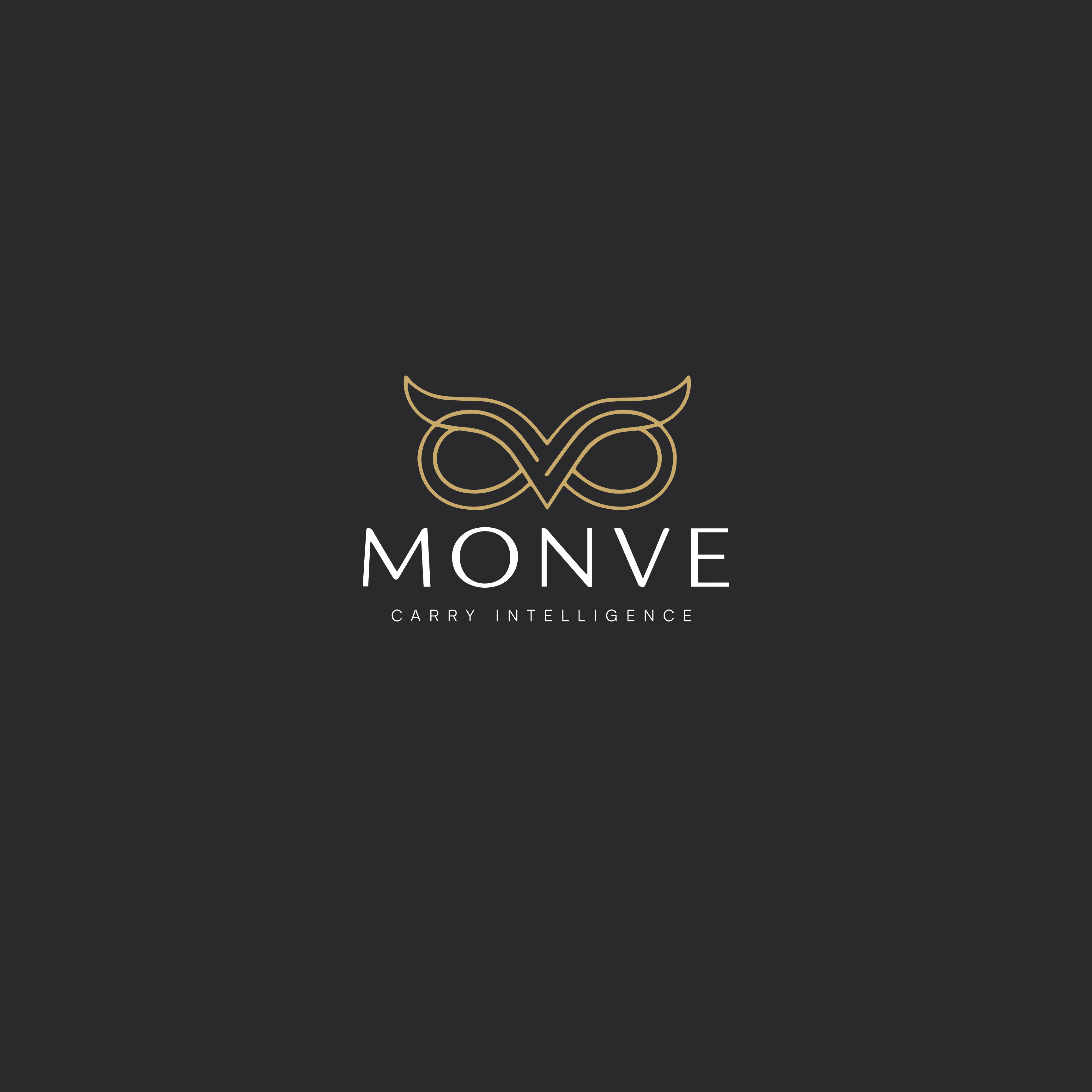
MONVE is a premium accessories brand designing refined, minimalist laptop bags for modern professionals, founders, and technology enthusiasts. The brief was to build a brand that felt as considered as the products themselves: quiet, precise, and unmistakably premium, without ever feeling loud.
We built the identity around a single idea: the tools people carry every day should reflect the same intelligence and craftsmanship as their work. That idea became the owl, a symbol of clarity and precision, redrawn as a continuous geometric line that quietly forms the letters M and V at its center. It works as a symbol on its own, and as a monogram up close, a mark that rewards a second look instead of shouting on the first.
Around that mark, we built a full system: a refined five-color palette anchored by a champagne gold, a two-typeface hierarchy (Satoshi for headlines and product copy, Inter for supporting text), and a documented brand voice that favors calm confidence over hype. Every guideline exists to keep MONVE feeling like one brand, whether it shows up on a product tag, a zipper pull, or a pitch deck.
A brand system precise enough to guide every future touchpoint, from product embossing to marketing campaigns, without another design decision needed from scratch.
The system, in detail.
Brand overview: what MONVE is, and who it's built for
Mission, vision, and values: the reasoning behind the brand
Brand personality: intelligent, minimal, calm, confident
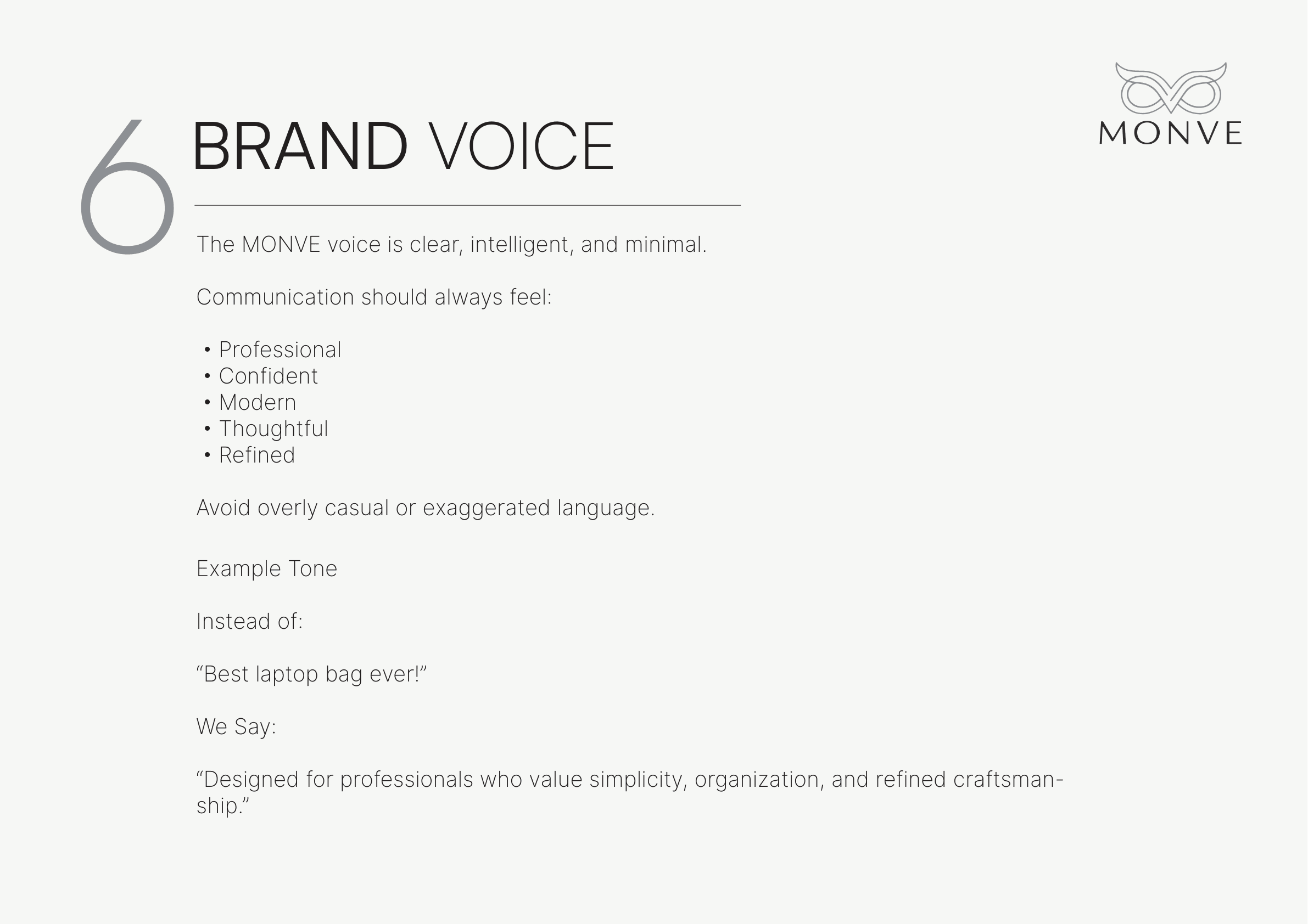
Brand voice: how MONVE sounds in writing, with real examples
Primary logo: owl emblem above the MONVE wordmark
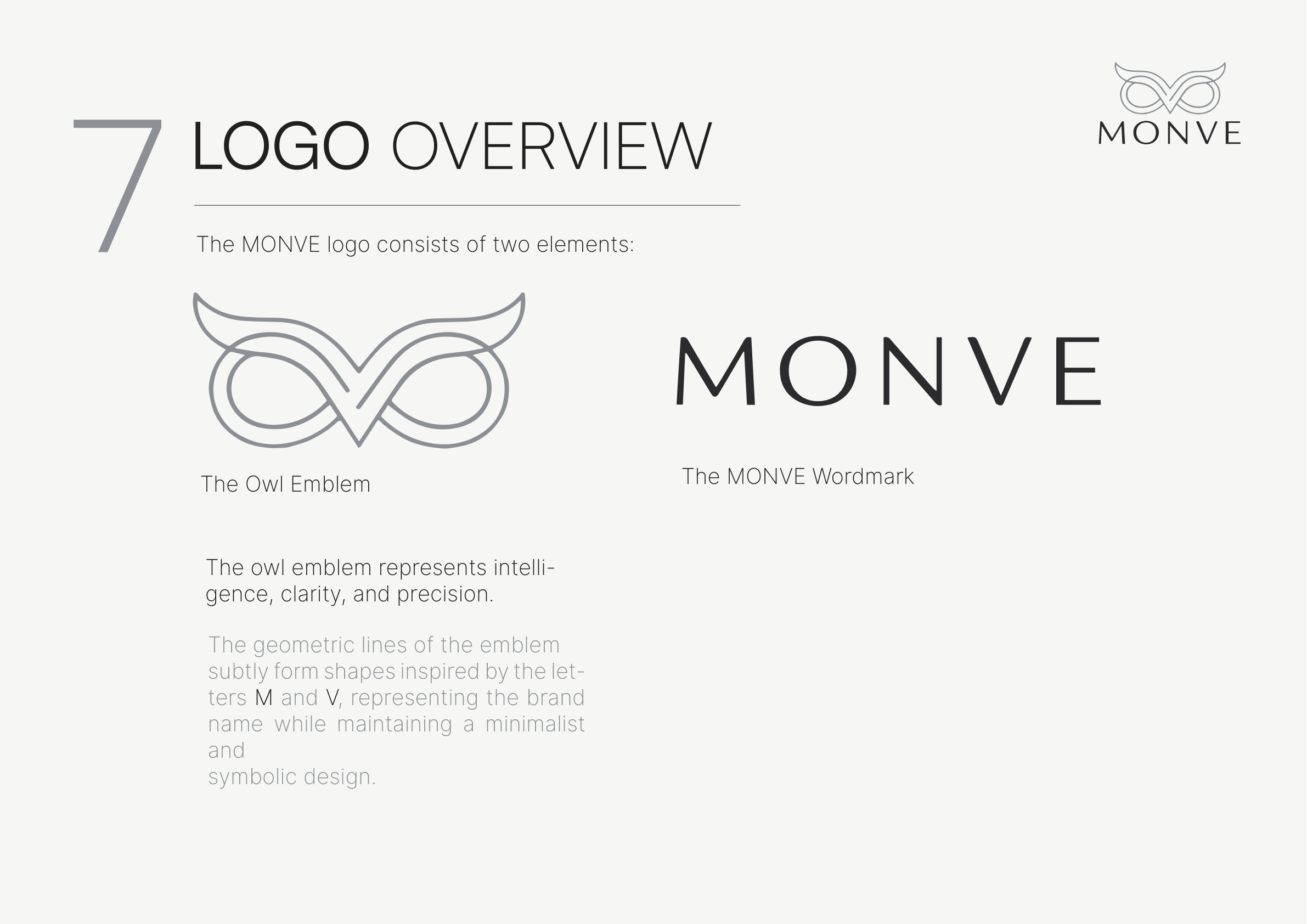
The two elements of the mark: the owl emblem and the MONVE wordmark
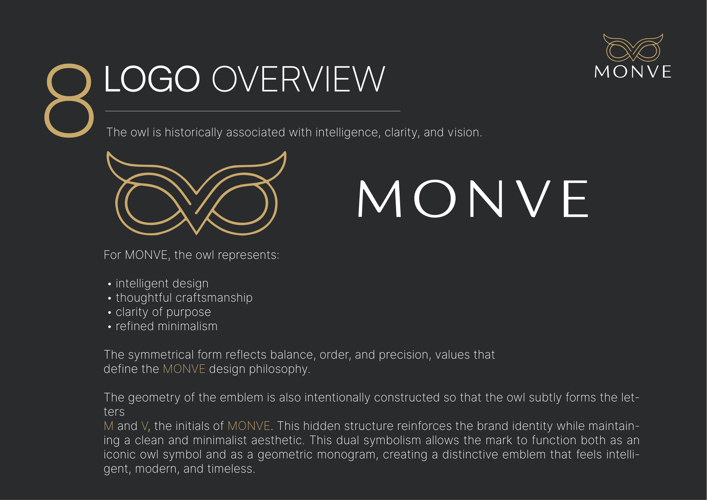
Why an owl: intelligence and clarity, with a hidden M and V monogram
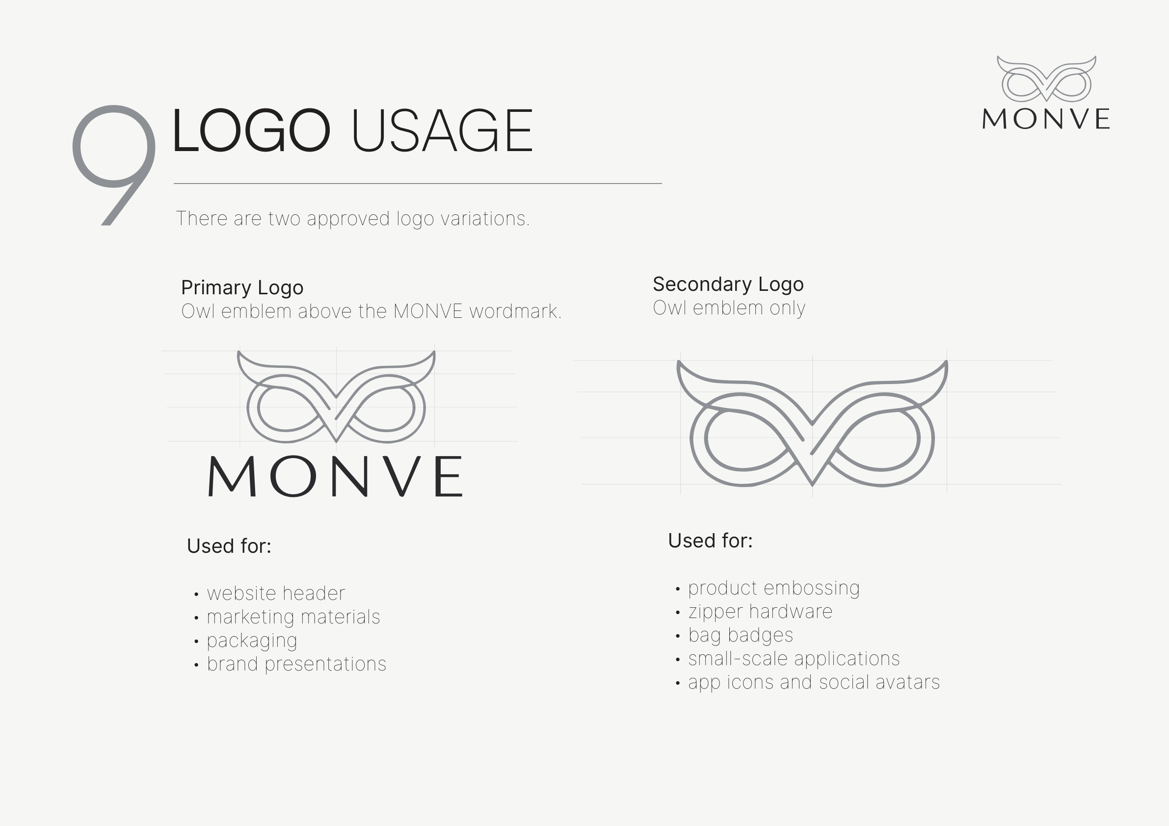
Primary and secondary logo variations, and when to use each
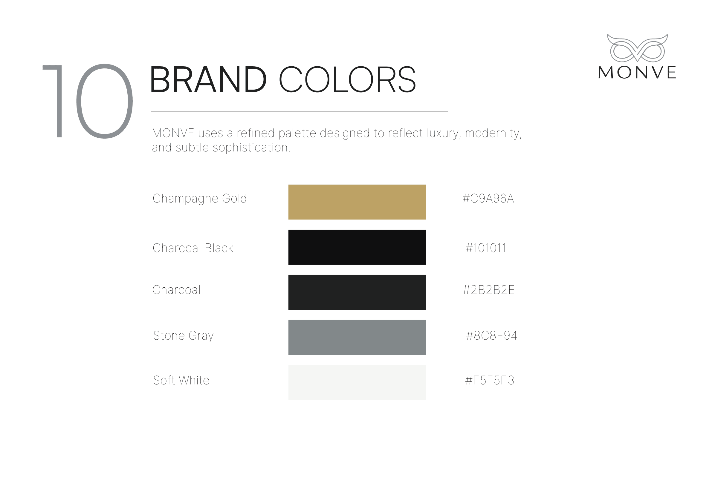
A five-color palette anchored by Champagne Gold
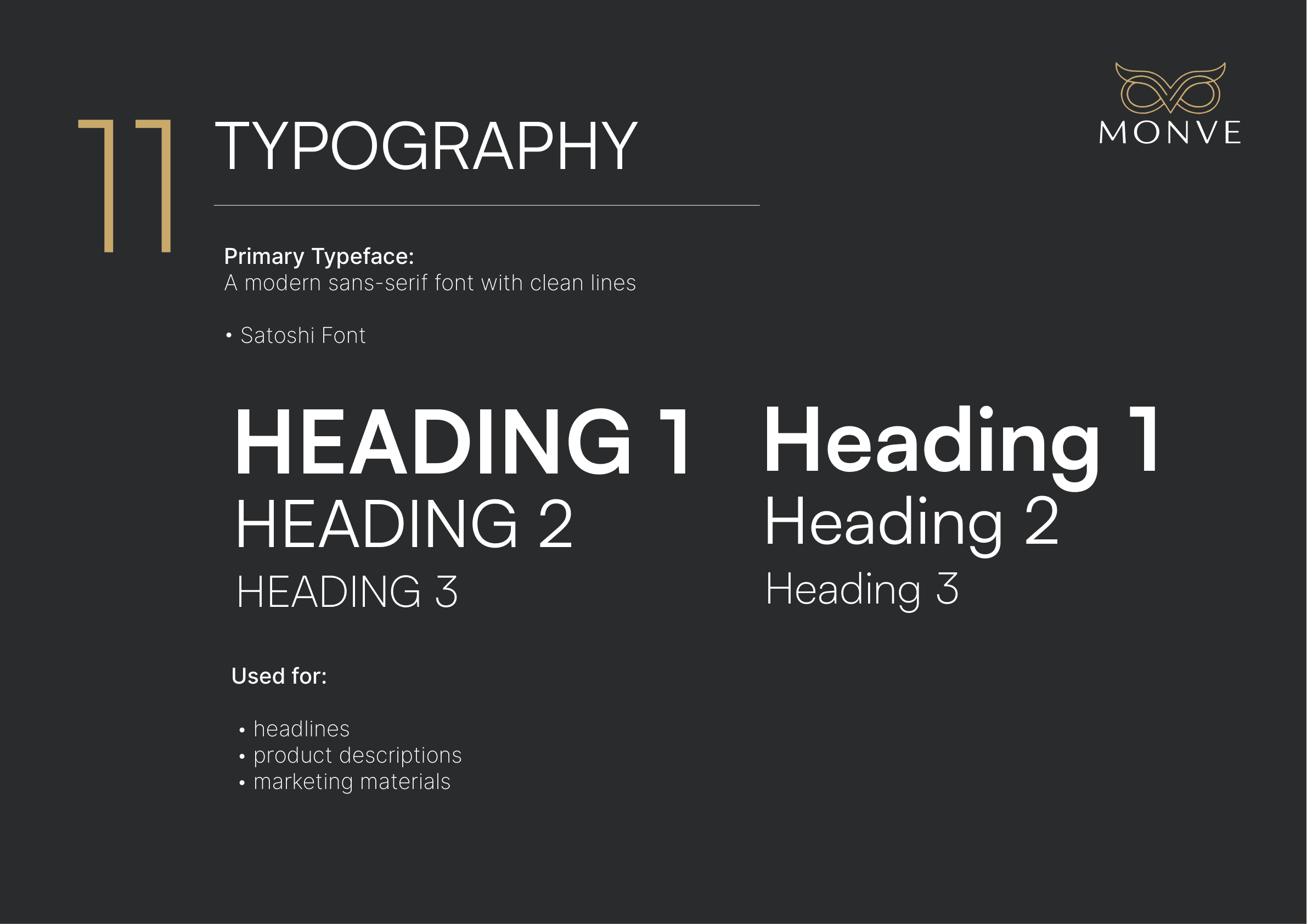
Satoshi for headlines, Inter for supporting text
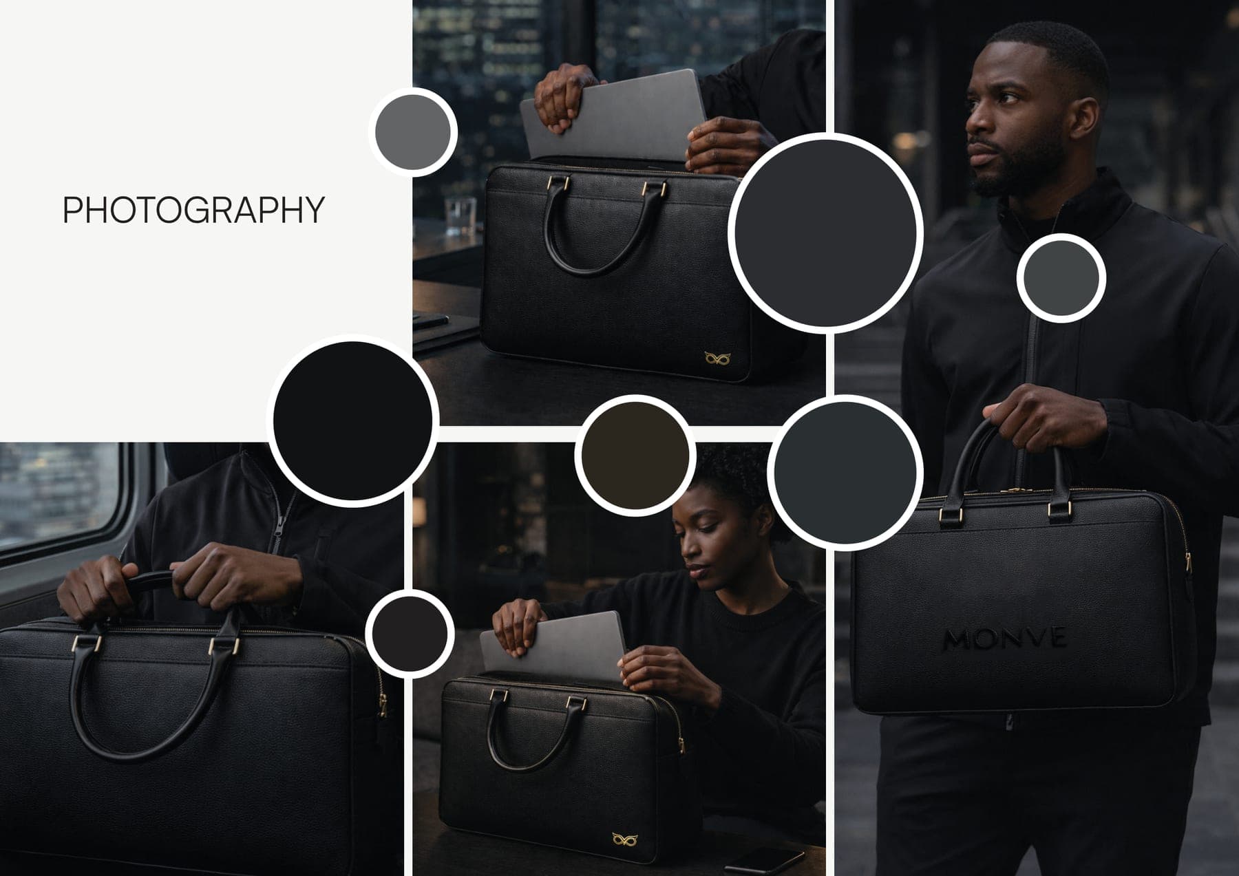
Photography direction: clean, modern, natural light
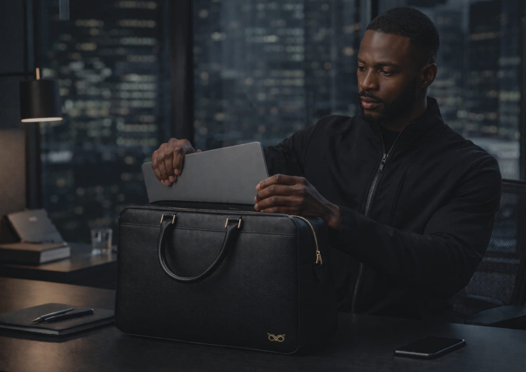
The identity carried through to real product photography
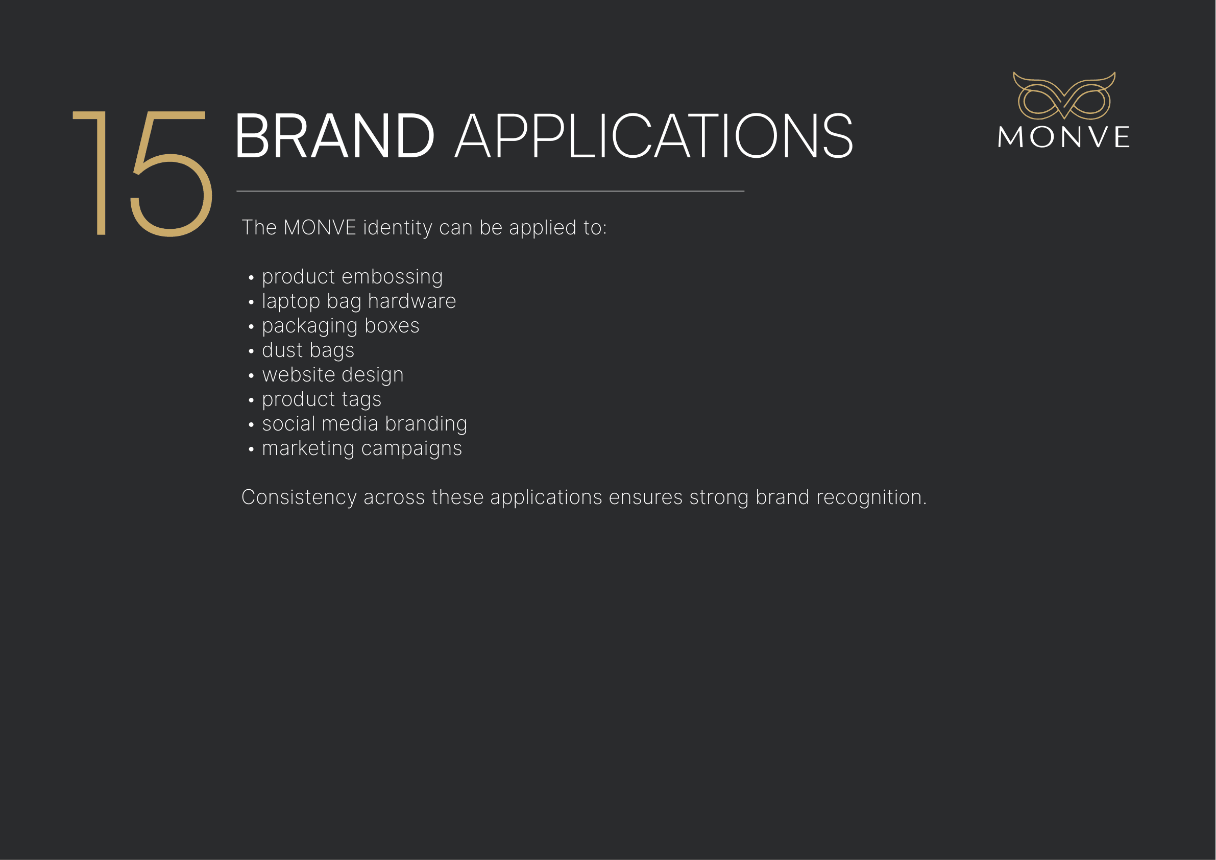
Where the identity shows up: packaging, hardware, site, and more
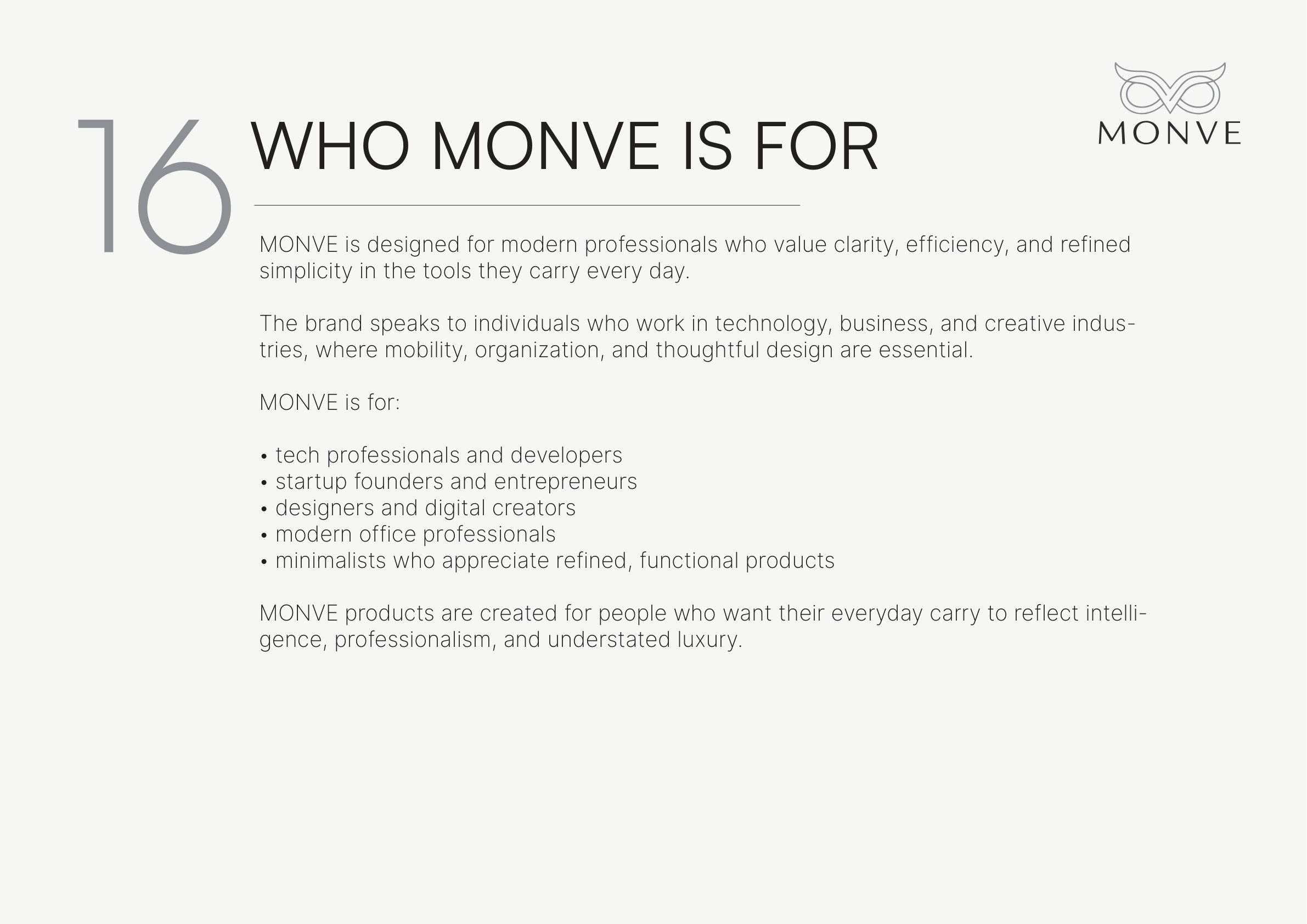
The audience the brand is built to speak to